February 19, 2024
Simple and attractive Login and Registration page using only HTML and CSS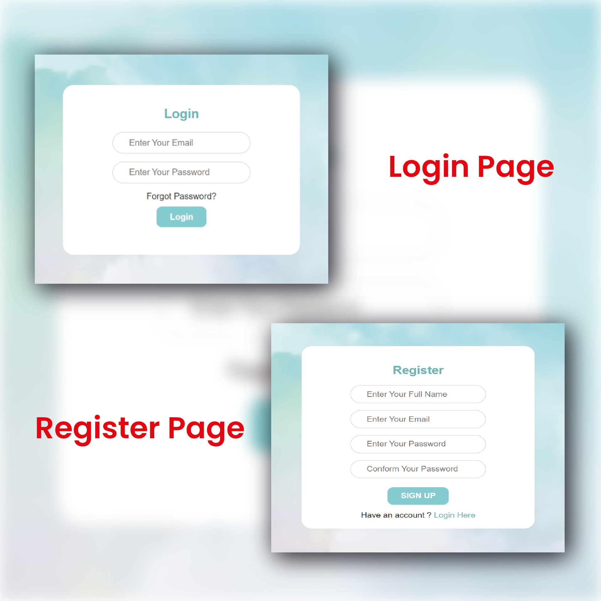
LOGIN PAGE :
Let's create a login page like the above image.
Require Field For Login Page:-
When designing a login page for a website or application, there are several essential fields you should include to ensure a secure and user-friendly experience. The required fields typically include:
Username or Email Address:
Users usually need to enter a unique identifier to access their accounts. It could be a username or an email address.
Password:
A secure password is crucial for account security. Encourage users to create strong passwords by providing guidelines.
Forgot Password:
A link or button that allows users to recover their account if they forget their password. This often involves sending a password reset email.
STEPS TO CREATE LOGIN PAGE
1 ) Setting up the HTML Structure
File name: index.html
<html>
  <head>
    <title>Login Page</title>
  </head>
  <body>
    <div >
      <h2>Login</h2>
      <form >
        <div >
          <input
            type="text"
            id="username"
            name="username"
            placeholder="Enter Your Email"
            required
          />
        </div>
        <div >
          <input
            type="password"
            id="password"
            name="password"
            placeholder="Enter Your Password"
            required
          />
        </div>
        <div >
          <a href="#">Forgot Password?</a>
        </div>
        <div>
          <button type="submit">Login</button>
        </div>
      </form>
    </div>
  </body>
</html>
The simple output of HTML :
This HTML code represents a simple and aesthetically pleasing login page. Let's break down the key components:
HTML (Structure):
HTML (Form Tags)
<form> Wraps the form elements for user input.
<input> Used for text and password input, with attributes such as type, id, name, placeholder, and required.
<a> Represents the "Forgot Password?" link.
2 ) Create The CSS File
There are three types of CSS:
- inline CSS
- internal CSS
- external CSS
we used class Selector in the code.
Make our login page more attractive using CSS.
File Name: style.css
<html>
 <head>
  <title>Login Page</title>
  <link rel="stylesheet" type="text/css" href="style.css" />
 </head>
 <body>
  <div >
   <h2>Login</h2>
   <form class="login-form">
    <div class="form-group">
     <input
      type="text"
      id="username"
      name="username"
      placeholder="Enter Your Email"
      required
     />
    </div>
    <div class="form-group">
     <input
      type="password"
      id="password"
      name="password"
      placeholder="Enter Your Password"
      required
     />
    </div>
    <div class="Forgot-Password">
     <a href="#">Forgot Password?</a>
    </div>
    <div class="form-group">
     <button type="submit">Login</button>
    </div>
   </form>
  </div>
 </body>
</html>
Give a link for used external CSS.
<link rel="stylesheet" type="text/css" href="style.css" />
1) first, we set the background image for the login page and centered the login form using Flex and their properties and also used background size for the background image.
body {
 font-family: Arial, sans-serif;
 background-image: url("./hand-painted-watercolor-pastel-sky-background_23-2148902771.avif");
 background-size: cover;
 margin: 0;
 padding: 0;
 display: flex;
 align-items: center;
 justify-content: center;
 height: 100vh;
}
background-image
This property sets the background image of an element. In your example, it's set to a relative path "./hand-painted-watercolor-pastel-sky-background_23-2148902771.avif". The image is in AVIF format. The AVIF format is a highly efficient image format that provides high-quality images with smaller file sizes compared to other formats like JPEG or PNG.
background-image: url("./hand-painted-watercolor-pastel-sky-background_23-2148902771.avif");
we give the path of the image and the user can use any image for background.
display: flex
This property defines a flex container. The value flex enables a flex context for all its direct children. This means the direct children of the element with this property will be treated as flexible items. The flex container expands items to fill available free space or shrinks them to prevent overflow.
align-items: center
This property aligns the items (children) along the cross-axis of the flex container. In this case, it centers them vertically because the cross-axis is the vertical axis.
justify-content: center
This property aligns the items (children) along the main axis of the flex container. In this case, it centers them horizontally because the main axis is the horizontal axis.
height: 100vh
This sets the height of the element to 100% of the viewport height. The vh unit is a relative unit based on the viewport height. So, 100vh means the element will take up the full height of the viewport, making it cover the entire screen vertically.
background-size: cover
This property ensures that the background image covers the entire element, even if it has to be stretched or cropped. It maintains the aspect ratio and covers the entire container without leaving any empty spaces.
Output:
2) After the center of the login form we give CSS to make our login form attractive using CSS like box-shadow, flex,text-align, padding,text-align, and border-radius.
.login-container {
 background-color: #fff;
 box-shadow: 0px 0px 10px rgba(186, 181, 181, 0.1);
 padding: 20px;
 border-radius: 20px;
 width: 400px;
}
.login-container h2 {
 text-align: center;
 color: #68b4b4;
}

.login-form {
 display: flex;
 flex-direction: column;
 align-items: center;
}
box-shadow
0px 0px 10px rgba(186, 181, 181, 0.1);: Applies a box shadow to the container with a slight blur and a light gray color, creating a subtle shadow effect.
padding: 20px
Adds 20 pixels of padding inside the container.
border-radius: 20px: Rounds the corners of the container, creating a border-radius of 20 pixels.
width: 400px
Sets the width of the container to 400 pixels.
text-align: center
Centers the text horizontally within the h2 element.
display: flex
Makes the form a flex container.
flex-direction: column
Arrange the children of the flex container in a column (stacked vertically).
align-items: center
Centers the items (form elements) along the cross-axis (vertical axis) of the flex container.
Output:
.form-group {
 margin-bottom: 15px;
}

.form-group label {
 font-weight: bold;
 margin-bottom: 5px;
}
.Forgot-Password a{
 text-decoration: none;
 color: #262929;

}
.form-group input {
 padding: 10px 30px;
 font-size: 16px;
 border: 1px solid #ccc;
 border-radius: 20px;
}
.form-group button {
 padding: 10px 25px;
 font-size: 16px;
 background-color:#80d4d4;
 color: #fff;
 border: none;
 border-radius: 10px;
 font-weight: bold;
 cursor: pointer;
 margin-top: 10px;
}
.form-group button
padding: 10px 25px
Adds padding inside the button.
font-size: 16px
Sets the font size of the button text to 16 pixels.
background-color:#80d4d4
Sets the background color of the button to a teal shade.
color: #fff
Sets the text color of the button to white.
border: none
Removes the border from the button.
border-radius: 10px
Round the corners of the button.
font-weight: bold
Sets the font weight of the button text to bold.
cursor: pointer
Changes the cursor to a pointer when hovering over the button.
margin-top: 10px
Adds a top margin of 10 pixels to create space between the button and other elements.
.form-group input:
padding: 10px 30px
Adds padding inside the input field.
font-size: 16px
Sets the font size of the input text to 16 pixels.
border: 1px solid #ccc
Adds a 1-pixel solid border with a light gray color.
border-radius: 20px
Round the corners of the input field.
Output: