February 19, 2024
Media Query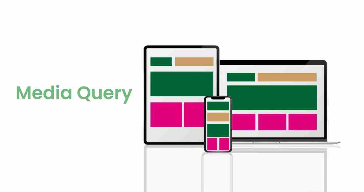
What is a Media Query?
A media query is like a set of rules for a website to look good on all kinds of screens, whether it's a big computer monitor or a small smartphone. It helps the website adjust its appearance so that it's easy to use no matter what device you're using.
This tool is crucial for web developers, enabling them to create websites that work seamlessly on any device, big or small.
Media query is used to make an over-website responsive.
Syntax:
@media media-type and (media-feature) {
//your code
}
@media: This is the keyword that defines a media query.
media-type: This specifies the type of media the query is targeting, such as screen, print, speech, etc. The most commonly used for web development is the screen.
and: This is a logical operator used to combine multiple media features.
media-feature: This represents the specific characteristic of the output device or viewport you want to target, such as width, height, orientation, etc.
Example:
<!DOCTYPE html>
<html lang="en">
  <head>
    <meta charset="UTF-8" />
    <meta name="viewport" content="width=device-width, initial-scale=1.0" />
    <style>
      body {
        font-family: Arial, sans-serif;
        margin: 0;
        padding: 0;
        background-color: aliceblue;
      }
      .container {
        display: flex;
        flex-wrap: wrap;
        justify-content: space-between;
      }
      .box {
        flex: 1;
        min-width: 200px;
        margin: 10px;
        padding: 20px;
        border: 1px solid #ddd;
        text-align: center;
        font-weight: bold;
        font-size: 20px;
      }
      #box-1{
        background-color: tomato;
      }
      #box-2{
        background-color: rgb(92, 255, 71);
      }
      #box-3{
        background-color: rgb(255, 71, 172);
      }
      #box-4{
        background-color: rgb(224, 255, 71);
      }
      @media (max-width: 600px) {
        .container {
          flex-direction: column;
        }
        .box {
          flex: 1 0 auto;
        }
      }
    </style>
    <title>Flexbox Media Query Example</title>
  </head>
  <body>
    <div class="container">
      <div class="box" id="box-1">Box 1</div>
      <div class="box" id="box-2">Box 2</div>
      <div class="box" id="box-3">Box 3</div>
      <div class="box" id="box-4">Box 4</div>
    </div>
  </body>
</html>
Explanation
 body {
    font-family: Arial, sans-serif;
    margin: 0;
    padding: 0;
    background-color: aliceblue;
 }
body Styles applied to the entire body of the document
font-family: Arial, sans-serif Sets the font family to Arial or a generic sans-series font style
margin: 0 Removes default margin from the body.
padding: 0 Removes default padding from the body.
background-color: aliceblue Sets the background color of the body to aliceblue.
.container {
    display: flex;
    flex-wrap: wrap;
    justify-content: space-between;
 }
container Styles applied to the container div.
display: flex Enables the Flexbox layout.
flex-wrap: wrap Allows items to wrap onto multiple lines.
justify-content: space-between Distributes space between the items evenly.
.box {
    flex: 1;
    min-width: 200px;
    margin: 10px;
    padding: 20px;
    border: 1px solid #ddd;
    text-align: center;
    font-weight: bold;
    font-size: 20px;
 }
.box Styles applied to each box within the container.
flex: 1 Allows the box to grow and take up available space.
min-width: 200px Sets a minimum width for the box.
margin: 10px Adds margin around the box.
padding: 20px Adds padding inside the box.
border: 1px solid #ddd Adds a 1px solid border with a light gray color.
text-align: center Centers the text horizontally.
font-weight: bold Sets the font weight for the text.
font-size: 20px Sets the font size for the text.
#box-1{
    background-color: tomato;
 }
 #box-2{
    background-color: rgb(92, 255, 71);
 }
 #box-3{
    background-color: rgb(255, 71, 172);
 }
 #box-4{
    background-color: rgb(224, 255, 71);
 }
#box-1, #box-2, #box-3, #box-4 Specific styles for each box identified by their IDs.
background-color Background colors are applied to each box
@media (max-width: 600px) {
    .container {
     flex-direction: column;
    }
    .box {
     flex: 1 0 auto;
    }
 }
@media (max-width: 600px) Media query for screens with a maximum width of 600 pixels. Changes the layout to a column when the screen width is 600 pixels or less.
.container is updated to have a flex-direction of the column.
.box is updated to have a flex-basis of auto.
Desktop Screen Output:
Tablet Screen Output:
Mobile Screen Output