Back to blog


September 07, 2024


Gautam Patoliya, Deep Poradiya
Tutor HeadCSS Animations and Transitions: Enhancing Web Visuals

CSS Animation and Transition are powerful tools used to create smooth visual effects on web pages, enhancing the user experience. Here's an overview of each:
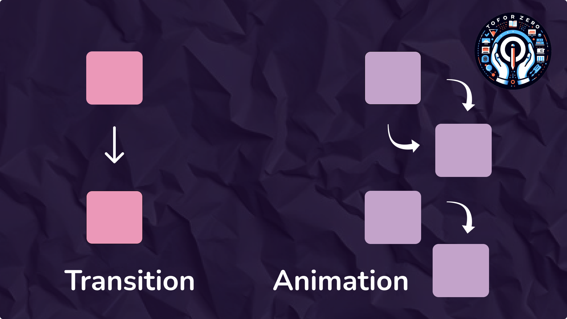
When to Use Transitions vs. Animations:
- Transitions are ideal for simple state changes, such as hover effects or toggling visibility. They are easy to implement and work well for straightforward interactions.
- Animations are more powerful and flexible, allowing for complex sequences of changes. They are useful for more elaborate effects, such as loading spinners, keyframe-based animations, or continuously repeating effects.
[A]. CSS Transition
- Purpose: CSS transitions allow you to change property values smoothly (over a given duration), rather than having them change instantly. They are great for simple hover effects, button interactions, or toggling visibility.
Key Properties:
- transition-property: Specify the CSS property you want to add the transition effect to (e.g., width, color, background-color, etc.).
- transition-duration: Defines how long the transition should take (e.g., 0.5s).
- transition-timing-function: Controls the speed curve of the transition (e.g., ease, linear, ease-in, ease-out, etc.).
- transition-delay: Sets a delay before the transition starts.
- Example:
<html>
<head>
<style>
.button {
  background-color: blue;
  transition: background-color 0.3s ease;
}
.button:hover {
background-color: green;
}
</style>
</head>
<body>
<h1>CSS Animation</h1>
<div class="button">Click Me</div>
</body>
</html>
- In this example, when the user hovers over the .button, the background color changes from blue to green over 0.3 seconds.
[B]. CSS Animation
- Purpose: CSS animations allow you to animate transitions between multiple states. Unlike transitions, which require a trigger like hover, animations can start automatically and loop continuously if desired.
Key Properties:
- @keyframes: Defines the sequence of styles for the animation. You can specify different styles at different points (percentages) in the animation.
- animation-name: The name of the @keyframes animation you want to apply.
- animation-duration: Specifies how long the animation takes to complete one cycle.
- animation-timing-function: Defines the speed curve of the animation.
- animation-delay: Sets a delay before the animation starts.
- animation-iteration-count: Specifies how many times the animation should repeat (e.g., infinite, 1, 3, etc.).
- animation-direction: Defines whether the animation should play in reverse on alternate cycles (e.g., normal, reverse, alternate, etc.).
- Example:
<html>
<head>
<style>
@keyframes move {
0% { transform: translateX(0); }
50% { transform: translateX(100px); }
100% { transform: translateX(0); }
}
.box {
width: 50px;
height: 50px;
background-color: red;
animation: move 2s ease-in-out infinite;
}
</style>
</head>
<body>
<h1>CSS Animation</h1>
<div class="box"></div>
</body>
</html>
HTML
CSS